Clustering and Profiling Time Epochs in Ethereum 2.0
Joseph Kholodenko, Gurdal Ertek
 Illustration by Kjpargeter - Freepik.com
In this article, we analyze the characteristics of different time epochs in the Ethereum 2.0 Medalla Testnet. Each epoch has different attributes such as the number of orphan slots (missing blocks), number of slashings and voluntary exits, and metrics regarding inclusion distance. Number of slashings actually refers to the number of slots with slashings, however referred to as such for convenience. Inclusion distance for a slot is defined as the number of slots passed until the block on that slot is included on the blockchain. Inclusion distance for an epoch is an aggregation over inclusion distances over slots, which can be represented with the average and standard deviation.
Definition of “Inclusion Distance”
To keep consistency with the amazing analyses and articles by pintail we will refer to this latency as inclusion distance. However, our definition of inclusion distance is different:
The block for a slot is immutably written/registered as soon as the first inclusion is done. Even though the Ethereum 2.0 network finalizes a block for a given slot (as soon as the first inclusion is completed), the computations still continue until the last inclusion slot. In our analysis, for each slot, the inclusion distance is defined as the maximum inclusion distance over all attestation aggregations, and over all committees that participated in the voting for that slot. In other words, our definition of “inclusion distance” is in a way equivalent to “maximum inclusion distance”.
While this metric is not directly measuring the time until the actual inclusion (which takes place with the first inclusion), it instead measures the time-wise inefficiency with respect to attestations and inclusions.
We apply cluster analysis, in particular K-means method, to create clusters of time epochs where the epochs in each cluster are similar in terms of their attributes, yet different than time epochs other clusters. Furthermore, we profile the clusters and compare the distribution of attribute across clusters of time epochs.
Statistical plots enable the formulation of hypotheses about the data, and formal hypothesis testing methods reveal the statistically significant differences for the means of attribute values accross clusters.
Data Sourcing, Extraction and Preparation
Our analysis is built on data from the Medalla testnet extracted using chaind API and shared in the form of an PostgreSQL dump, whose latest version can be accessed from here. The data was kindly shared by Jim McDonald on ethstaker Discord channel, under #medalla-data-challenge group.
The successive steps of data extraction and data preparation are described in our earlier article.
As a result of data extraction and preparation, we form a dataset suitable for clustering and profiling, based on aggregated epoch level data consisting of the following fields:
- Inclusion Distance Avg
- Inclusion Distance Std Dev
- Attester Slashings
- Voluntary Exits
- Missing Blocks
Our objective was to identify non-temporal characteristics of the time epochs, hence epoch was not included as an input attribute.
Techniques Used and Implementation
Among the methods of data analytics, machine learning has a particularly special importance. Machine learning refers to computer algorithms learning from data, and can be unsupervised, semi-supervised, and supervised. In unsupervised machine learning, the algorithm is provided only with the data itself, without any specified output (e.g. class labels). Frequently used unsupervised machine learning methods include clustering, association mining, and dimensionality reduction. In supervised machine learning, the algorithm is trained using a target attribute. Frequently used supervised machine learning methods are regression and classification.
In this article, we use the unsupervised machine learning method of KMeans clustering, along with bar charts, box plots, and 3D visualization of attributes to illustrate heterogeneity across clusters. Following visual analytics, we apply non-parametric statistical hypothesis testing through the Dunn test to determine statisical differences between groups.
For voluntary exits and attester slashings, we omit the box plot due to a limited amount of non 0 data.
For the accompanying code for this analysis, check out this link.
Clustering of Slots
K Means clustering creates k clusters where each cluster consists of a subset of datapoints that are similar to each other with respect to attribute values. Yet the data points in a cluster are different compared to data points in other clusters. K Means produces cluster labels for data points as the main output of the algorithm.
A critical parameter in K Means is the number of clusters, k. While a multitude of metrics and methods exist on deciding the optimal k, we used Silhouette score as the metric to account for the mean intra-cluster distance and the mean nearest-cluster distance for each sample. In other words, Silhouette score is a reliable measure of both similarity within clusters and separation from other clusters. We determined the number of k clusters by looking for the maximum Silhouette score. A score close to 1 indicates non-overlapping clusters, whereas a score near 0 indicates overlapping clusters.
The following figure shows silhouette score values for different numbers of clusters in K means.
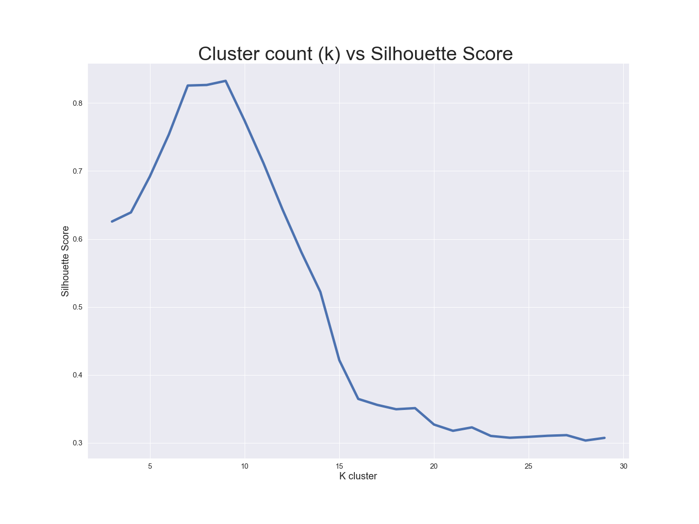 Based on the figure above, k=9 is associated with the highest Silhouette score value with the highest separation across clusters.
After selecting k=9, we looked at the counts of data per cluster. 7 of the 9 clusters had 800-1000 points per cluster while 2 clusters had < 40 points per cluster. Therefore, we decided to drop those two small clusters from the dataset.
Based on the figure above, k=9 is associated with the highest Silhouette score value with the highest separation across clusters.
After selecting k=9, we looked at the counts of data per cluster. 7 of the 9 clusters had 800-1000 points per cluster while 2 clusters had < 40 points per cluster. Therefore, we decided to drop those two small clusters from the dataset.
Insights - How do metrics vary across clusters?
Having decided on the number of clusters (k=7), and having determined the datapoints in each cluster, the next step of our analysis was the profiling of clusters. To this end, our first visual analysis was a 3D visualization where our 3 axes are InclusionDistanceAvg, InclusionDistanceStdDev, and MissingBlocks, where color denotes the cluster ID. We selected these three attributes as a method to illustrate separation and overlap across cluster groups.
The 3D vizualization constructed using Plotly, is interactive and allows the user to develop a feel for different characteristics of each cluster. Mousing over individual data points reveals the data values and corresponding cluster assignments.
Inclusion Distance (in slots, per epoch)
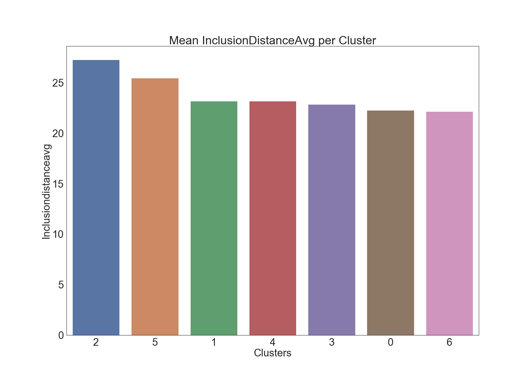
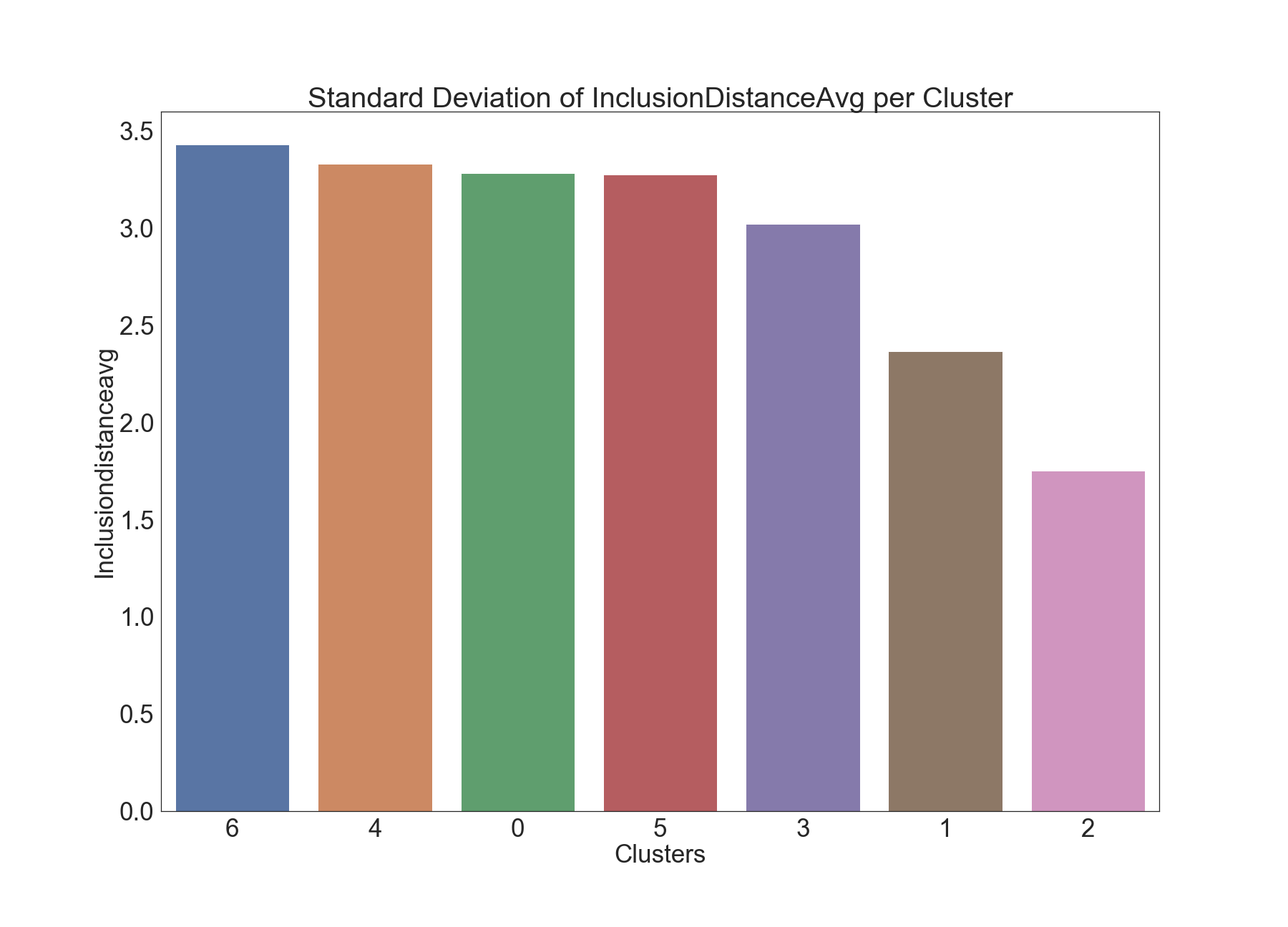
We begin the profiling of clusters with average and standard deviation of inclusion distance per epoch, namely InclusionDistanceAvg and InclusionDistanceStdDev, which is computed over the inclusion distances in all 32 slots within that epoch.
Inclusion Distance Average
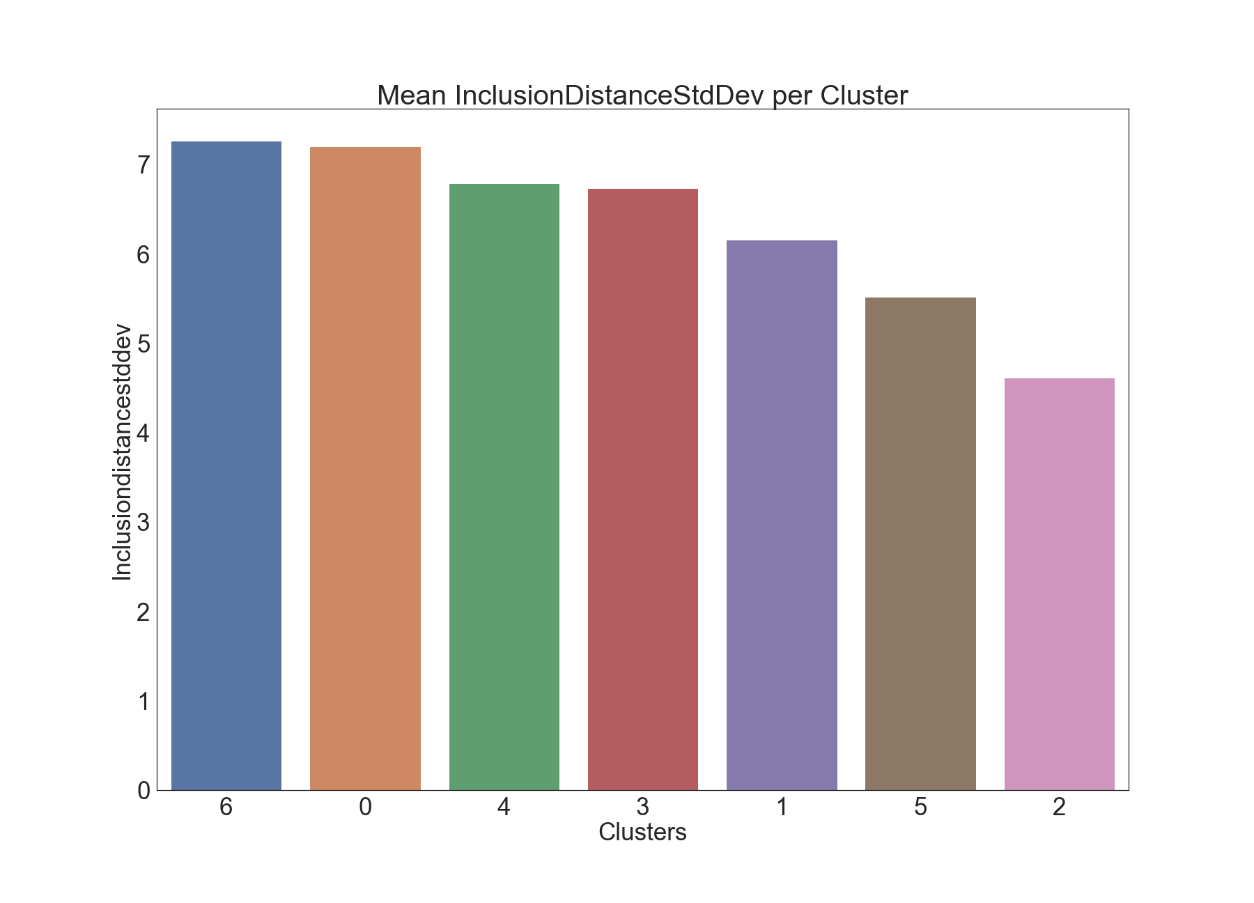
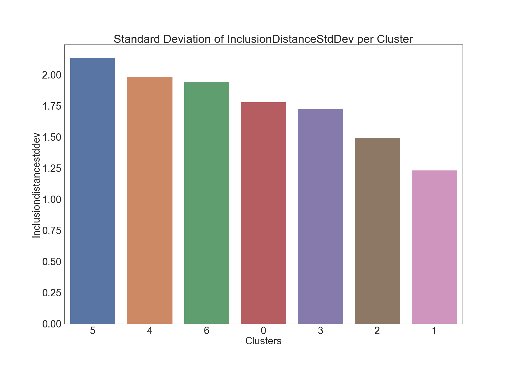
The bar charts provided below present statistics for (average and standard deviation) of averagen inclusion distance for each cluster:
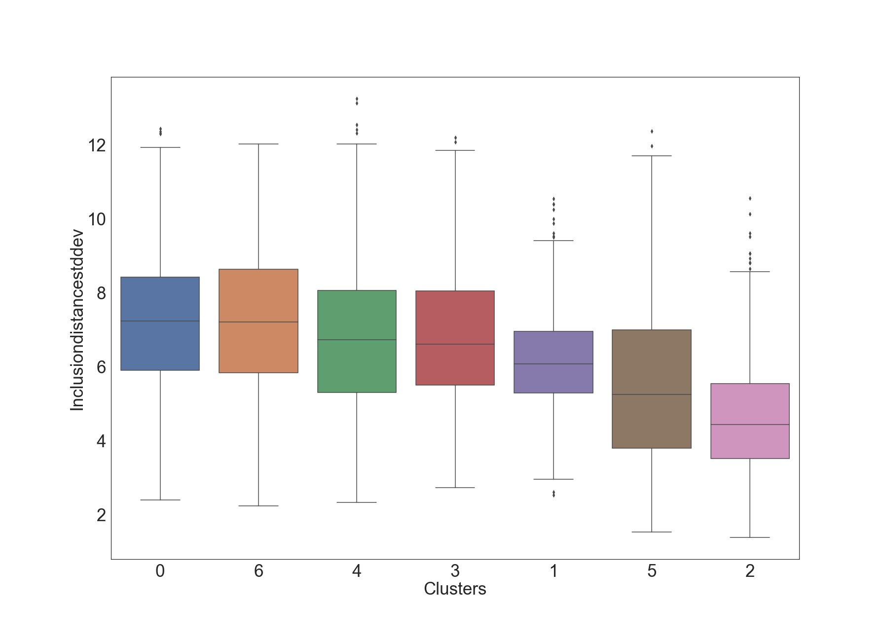
Next, the box plot shows more information about each cluster (e.g. inter-quartile range IQR, outliers).
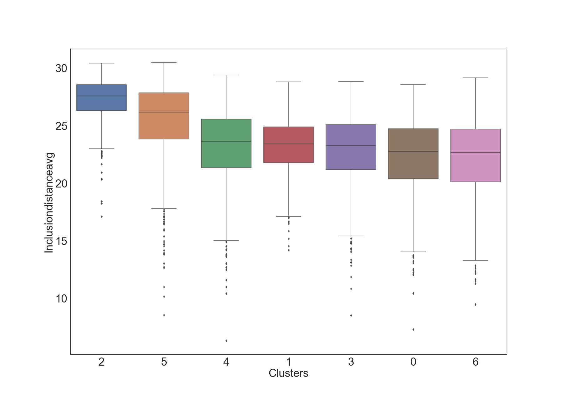
The first two clusters (2 and 5) in the box-plot seem to have visibly higher values of InclusionDistanceAvg, compared to the other clusters. This suggests these two clusters represent time epochs where there is inefficiency time-wise. This insight is also confirmed in the next plot.
A similar analysis is the comparison of the best fit empirical distributions across clusters as given below.
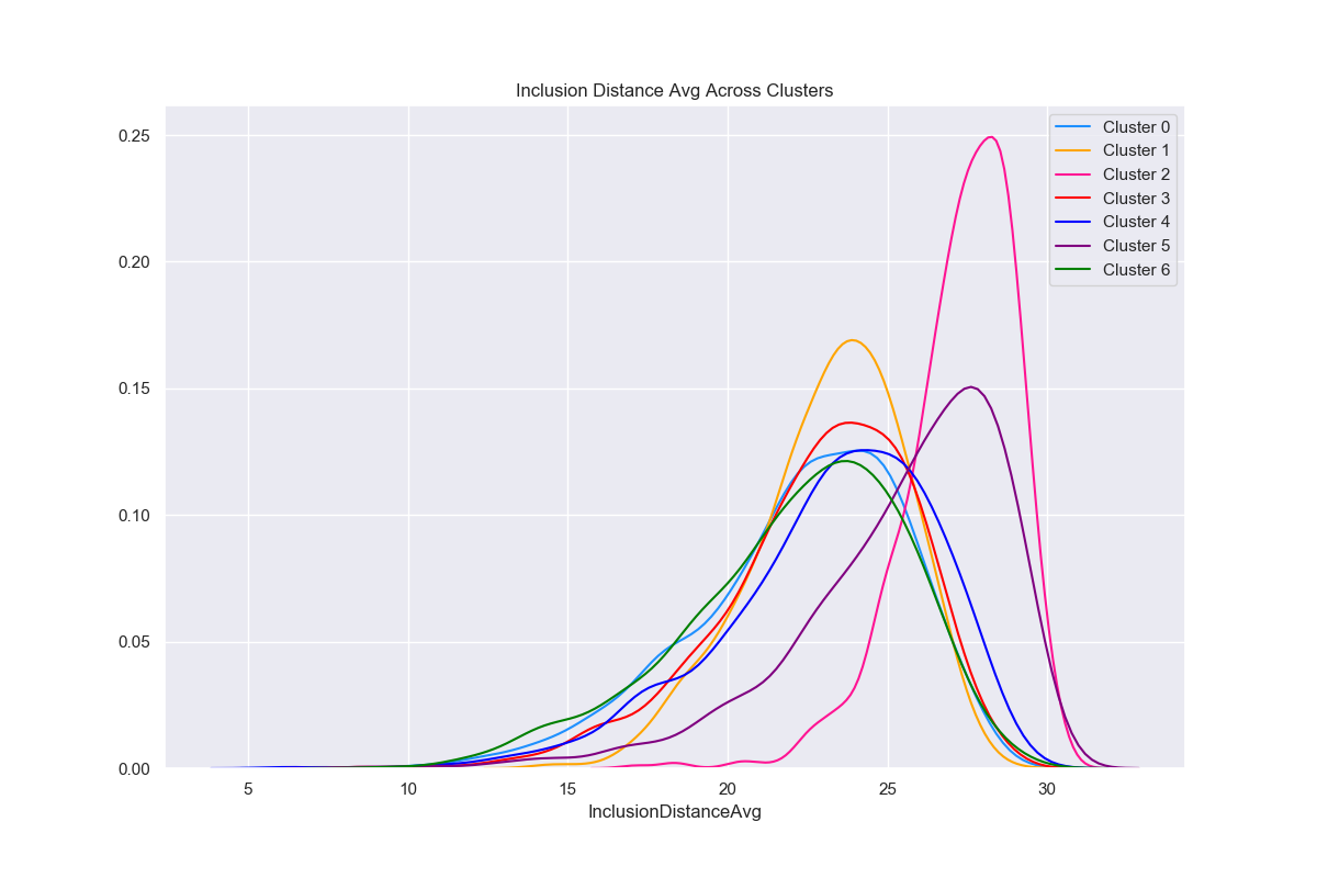
Both the box plot and the best-fit empirical distributions above suggest differences across clusters with regards to the mean of InclusionDistanceAvg.
Dunn test
Motivated by the heterogeneity of the clusters as shown above, the next step was to apply formal hypothesis testing to determine the statistical significance of pairwise cluster means. To this end, we applied the non-parametric Dunn test with Bonferroni correction, which yielded the following results.
| 0 | 1 | 2 | 3 | 4 | 5 | 6 | |
|---|---|---|---|---|---|---|---|
| 0 | 0 | 1 | 1 | 0 | 1 | 1 | 0 |
| 1 | 1 | 0 | 1 | 0 | 0 | 1 | 1 |
| 2 | 1 | 1 | 0 | 1 | 1 | 1 | 1 |
| 3 | 0 | 0 | 1 | 0 | 0 | 1 | 1 |
| 4 | 1 | 0 | 1 | 0 | 0 | 1 | 1 |
| 5 | 1 | 1 | 1 | 1 | 1 | 0 | 1 |
| 6 | 0 | 1 | 1 | 1 | 1 | 1 | 0 |
In the table, a value of 1 denotes a statistically significant difference (p-value <= 0.01) in means between that pair of attributes.
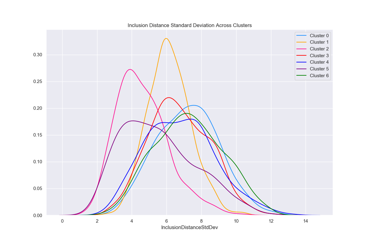
Inclusion Distance Standard Deviation
The below graphics describe the variation of Inclusion Distance Standard Deviation across clusters.
This time, clusters 2 and 5 seem to have visibly lower values compared to other clusters with respect to InclusionDistanceStdDev.
Results of Dunn Test:
| 0 | 1 | 2 | 3 | 4 | 5 | 6 | |
|---|---|---|---|---|---|---|---|
| 0 | 0 | 1 | 1 | 1 | 1 | 1 | 0 |
| 1 | 1 | 0 | 1 | 1 | 1 | 1 | 1 |
| 2 | 1 | 1 | 0 | 1 | 1 | 1 | 1 |
| 3 | 1 | 1 | 1 | 0 | 0 | 1 | 1 |
| 4 | 1 | 1 | 1 | 0 | 0 | 1 | 1 |
| 5 | 1 | 1 | 1 | 1 | 1 | 0 | 1 |
| 6 | 0 | 1 | 1 | 1 | 1 | 1 | 0 |
In the table, a value of 1 denotes a statistically significant difference (p-value <= 0.01) in means between that pair of attributes.
Attester Slashings
The below graphics describe the variation of Attester Slashings across clusters.
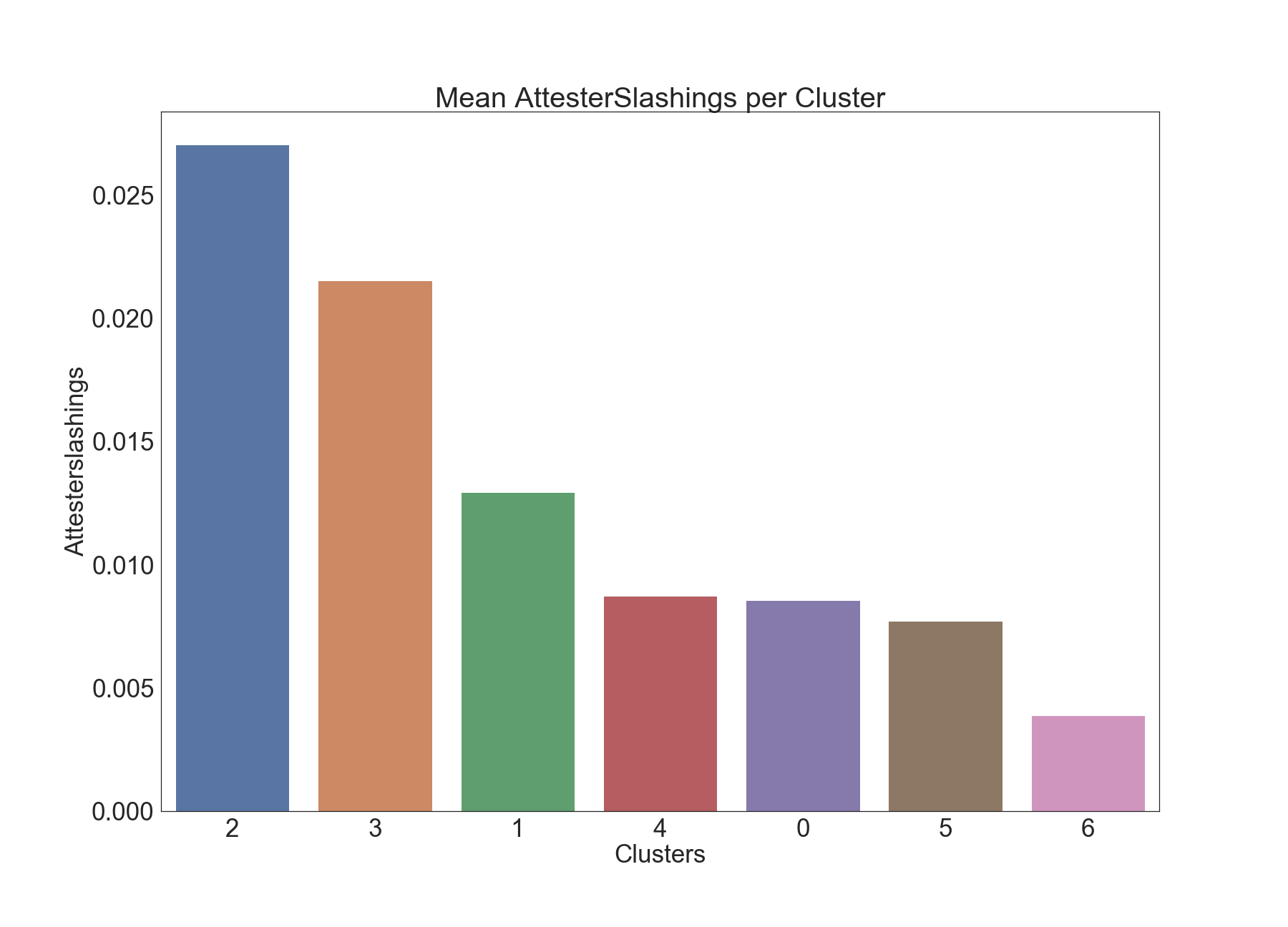
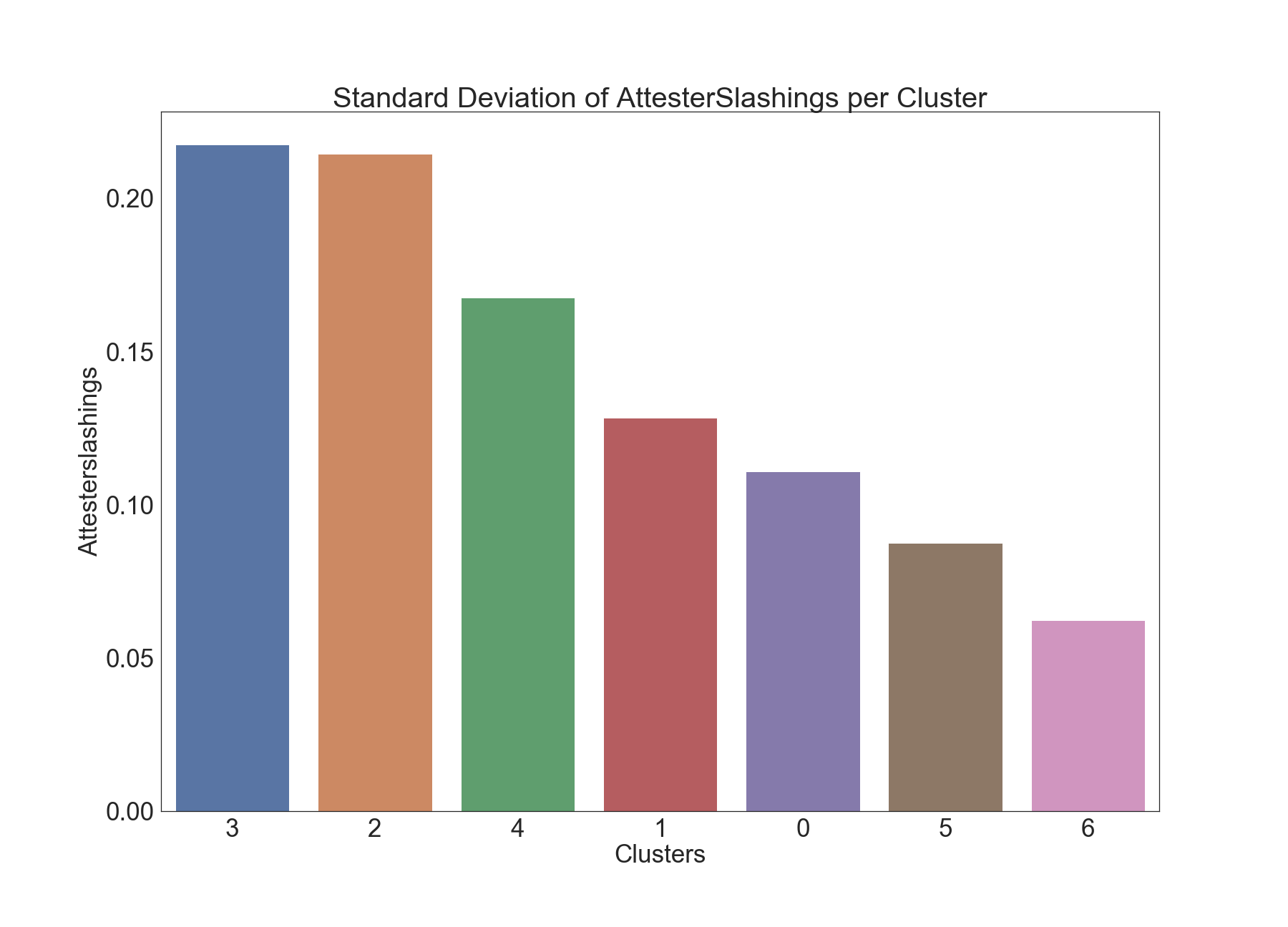
We can see clear separation among clusters 2 and 6 when it comes to Attester Slashings. This is confirmed by the Dunn test results below as well. It would be interesting to further examine the epochs in Cluster 2, as there are significantly higher numbers of Attester Slashings in those epochs.
Results of Dunn Test:
| 0 | 1 | 2 | 3 | 4 | 5 | 6 | |
|---|---|---|---|---|---|---|---|
| 0 | 0 | 0 | 0 | 0 | 0 | 0 | 0 |
| 1 | 0 | 0 | 0 | 0 | 0 | 0 | 0 |
| 2 | 0 | 0 | 0 | 0 | 0 | 0 | 1 |
| 3 | 0 | 0 | 0 | 0 | 0 | 0 | 0 |
| 4 | 0 | 0 | 0 | 0 | 0 | 0 | 0 |
| 5 | 0 | 0 | 0 | 0 | 0 | 0 | 0 |
| 6 | 0 | 0 | 1 | 0 | 0 | 0 | 0 |
In the table, a value of 1 denotes a statistically significant difference (p-value <= 0.01) in means between that pair of attributes.
Voluntary Exits
The below graphics describe the variation of Voluntary Exits across clusters.
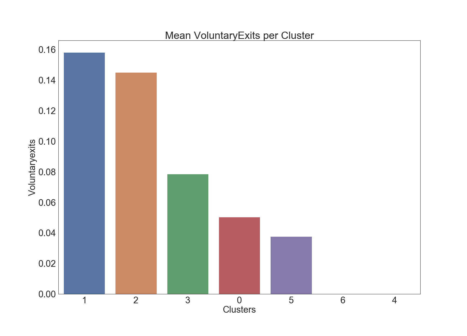
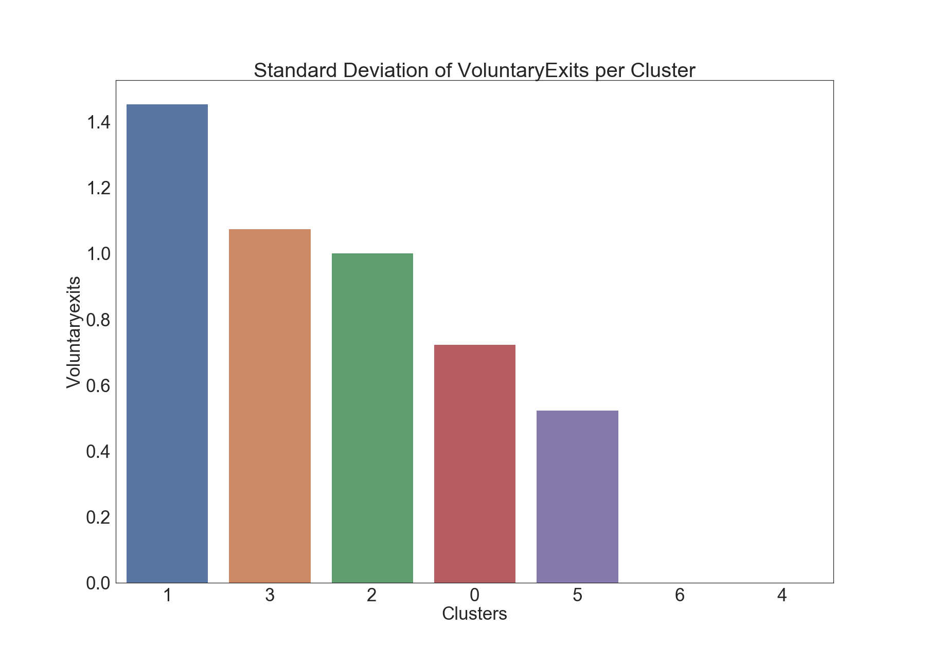
The k-means clustering algorithm placed epochs with more voluntary exits into clusters 1 and 2.
Results of Dunn Test:
| 0 | 1 | 2 | 3 | 4 | 5 | 6 | |
|---|---|---|---|---|---|---|---|
| 0 | 0 | 0 | 1 | 0 | 0 | 0 | 0 |
| 1 | 0 | 0 | 0 | 0 | 1 | 0 | 1 |
| 2 | 1 | 0 | 0 | 1 | 1 | 1 | 1 |
| 3 | 0 | 0 | 1 | 0 | 0 | 0 | 0 |
| 4 | 0 | 1 | 1 | 0 | 0 | 0 | 0 |
| 5 | 0 | 0 | 1 | 0 | 0 | 0 | 0 |
| 6 | 0 | 1 | 1 | 0 | 0 | 0 | 0 |
In the table, a value of 1 denotes a statistically significant difference (p-value <= 0.01) in means between that pair of attributes.
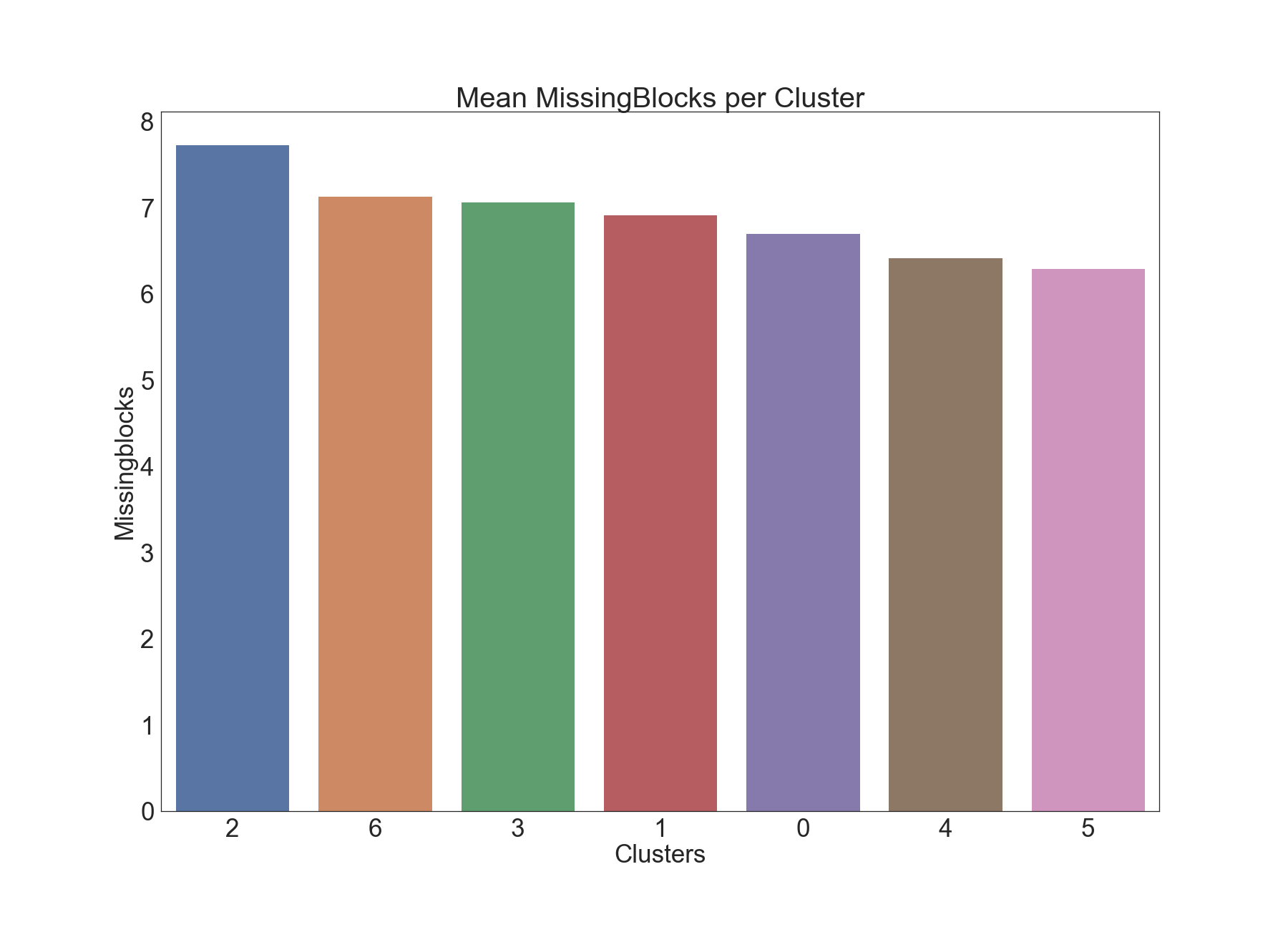
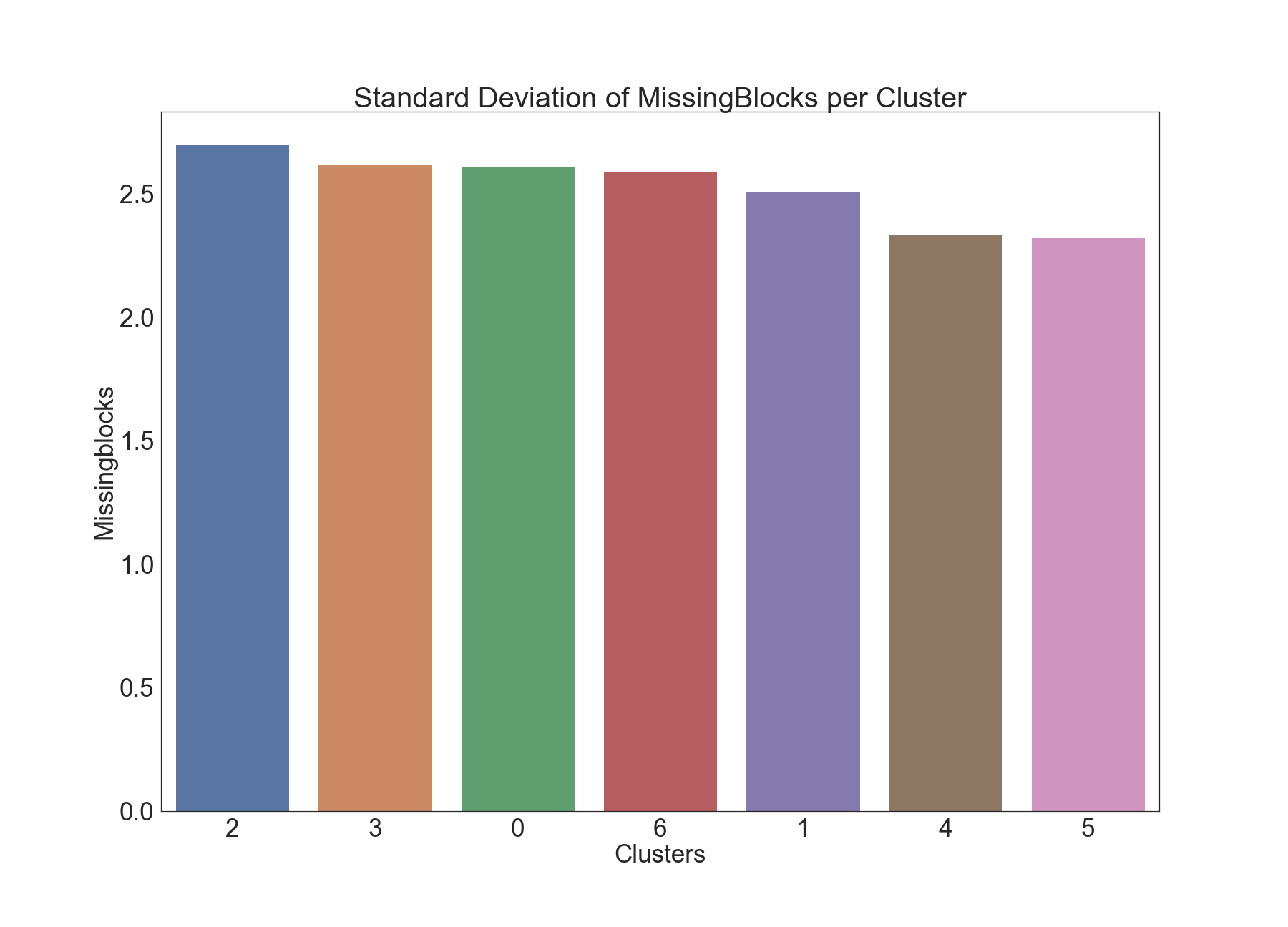
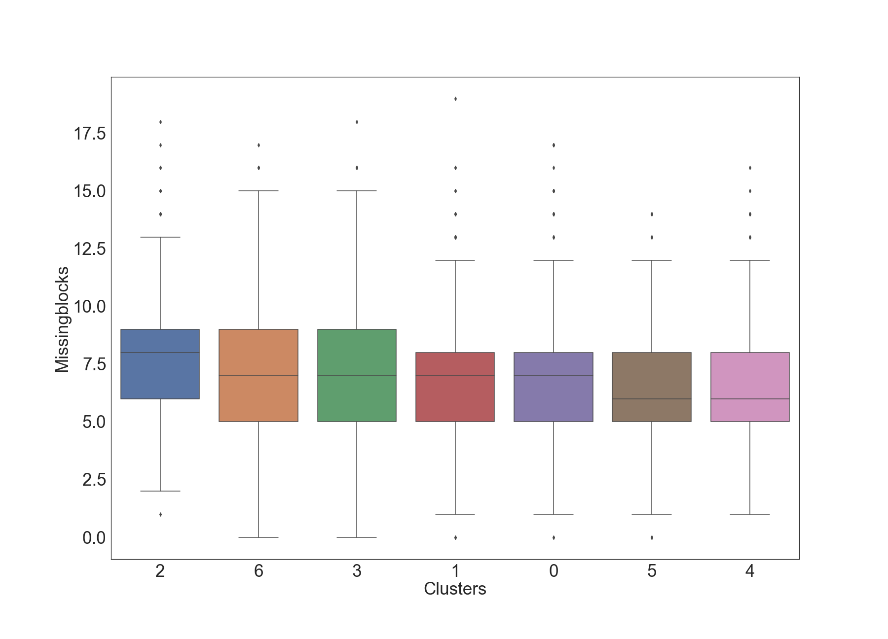
Missing Blocks
The below graphics describe the variation of Missing Blocks across clusters.
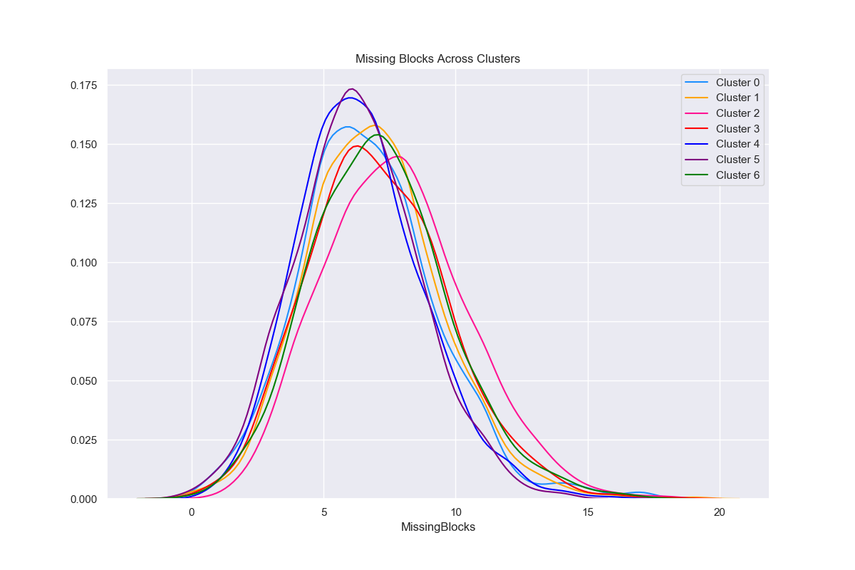
Results of Dunn Test:
| 0 | 1 | 2 | 3 | 4 | 5 | 6 | |
|---|---|---|---|---|---|---|---|
| 0 | 0 | 0 | 1 | 0 | 0 | 0 | 1 |
| 1 | 0 | 0 | 1 | 0 | 1 | 1 | 0 |
| 2 | 1 | 1 | 0 | 1 | 1 | 1 | 1 |
| 3 | 0 | 0 | 1 | 0 | 1 | 1 | 0 |
| 4 | 0 | 1 | 1 | 1 | 0 | 0 | 1 |
| 5 | 0 | 1 | 1 | 1 | 0 | 0 | 1 |
| 6 | 1 | 0 | 1 | 0 | 1 | 1 | 0 |
In the table, a value of 1 denotes a statistically significant difference (p-value <= 0.01) in means between that pair of attributes.
Future Work
In our future work we look to examine the following approaches:
- Defining inclusion delay as an aggregation across validators as in pintail’s analysis, since an attestation can be part of numerous blocks.
- Apply soft clustering techniques, e.g. Gaussian Mixture Modeling, to build a more nuanced profile from cluster to cluster.
- Apply predictive modeling, e.g. classification to rank attributes as predictors of cluster labels.
Acknowledgements
We thank the authors of all the resources used in the article, as well as the Ethereum Community and Foundation. We especially thank Jim McDonald for sharing the data used in the article and answering our many questions, Ben Eddington for his rigorous documentation, pintail for openly sharing his analysis with the ethstaker community, and Butta.eth for answering our questions on ethstaker. We also thank Ivan Liljeqvist and the Ivan on Tech team for creating a thriving community and motivating blockchain content.
Sign up to receive updates and analyses from us in the future:
Authors
 |
Joseph Kholodenko is a freelance data science consultant. In the past he has worked as a Data Scientist at Google and taught at the Flatiron School as a Senior Lead Data Science Instructor. He is currently pursuing his MS in Computer Science with a specialization in machine learning at Georgia Institute of Technology. |
 |
Gürdal Ertek is an Associate Professor at UAE University (UAEU), Al Ain, UAE. He received his Ph.D. from Georgia Institute of Technology, Atlanta, GA, in 2001. Dr. Ertek served in educational and research organizations in Turkey, USA, Singapore, Kuwait and UAE, as well as an on-site reviewer for 50+ industrial R&D projects. His research and teaching areas include applied data science, business analytics, supply chain management, project management, and R&D management. Dr. Ertek's research and other work can be accessed through ErtekProjects.com |
APPENDIX: Software Stack & Tools
- Data Extraction
- PostgreSQL for opening the database dump provided by Jim McDonald
- Data Preparation
- Pandas https://pandas.pydata.org/docs/
- Numpy https://numpy.org/doc/
- Google Sheets for merging data from multiple SQL queries scalably on the cloud
- MS Excel for cleaning, adding new derived attributes, adding new attributes with jittering, and pivot analysis
- Clustering and Statistical Tests
- Data Visualization